Although often used in the typographer’s (digital) practice, the origin of the terms ‘em-square’ and ‘en-square’ seem to be quite unclear. I did some research and developed some models, of which I discuss and show a couple here. Because of lack of historical documentation, to a certain extent speculation is in this case unavoidable. After I published some of my ideas on the web, I noticed that these were considered a bit controversial and I received reactions from a couple of prominent experts on type like ‘The em quad is also called a “mutton” and the en quad a “nut” space, but I don’t think you will learn much by taking pictures of sheep and nuts and measuring them […] I don’t think the measurements of Jenson etc. are that relevant either. […]’, and ‘The em quad by the way, […] is simply a ‘square’ space (which is what ‘quadrat’ means), determined by the body of the type that is being cast. The en is half its width. No direct relationship to any letter is intended: the terms are figures of speech.’
Although I can’t exclude that the terms em- and en-square are just not more than ‘figures of speech’, at least from a scientific point of view this subject deserves more research, I reckon. So, ‘measurements of Jenson etc.’ are actually quite relevant in my opinion.

Jenson’s famous roman type from 1470
The illustration above shows the relation between the height and the width of the capital N from Jenson’s roman type applied in Epistolæ ad Brutum from 1470 using a repetition, i.e., fence, of n’s. The counters in the m are in Jenson’s type identical to the one in the n. The height of the N also fits within the stems of the m and subsequently the N fits in a square. The illustration below shows the same relation for Griffo’s capitals from the Hypnerotomachia Poliphili (1499). On top and rotated left is the m, at the bottom a repetition of n’s.

Griffo’s roman type from 1499
This ‘m-square’ is definitely something else than what is called ‘em-square’ or ‘em’ in contemporary typography. In digital typography, the em-square is a ‘real’ square based on the body size; normally the distance from the top of the ascender to the bottom of the descender. The ‘em’ equals therefore the body or type size. In foundry type casting on the edges of the body was technically complex and hence the distance between the top of the ascenders and the bottom of the descenders was somewhat smaller than the body. In type cast before the eighteenth century, the leading was included in the body, so the ascenders and descenders were surrounded by more space.
Moxon writes in Mechanick Exercises that ‘By Body is meant, in Letter- Cutters, Founders and Printers Language, the Side of the Space contained between the Top and Bottom Line of a Long Letter’, which is annotated by Davis and Carter as being ‘Not a good definition because letters are often cast on a body larger than it need be. It is the dimension of type determined by the body of the mould in which it was cast’ (Joseph Moxon [Herbert Davis, Harry Carter, ed.], Mechanick Exercises [New York, 1978]).
In digital type ascenders and descenders can stick outside the body without any (physical) problem. Parts are placed outside the em-square anyway, such as, for example, the diacritics in capital letters. Nevertheless, some designers will basically try to copy the structure of foundry type, just to prevent clipping when no line spacing is applied.
In the times of the hot-metal and photographic composing machines, the em-square was a rectangle that could be square, depending on the design. Vertically the proportions were defined by the body size and in horizontal direction by the width of the widest character, which could be the M or W, which was divided in a certain number of units.

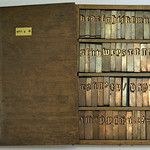
Monotype matrix case
Although the term em-square is often related with the character width of the capital M, which provided the standard for the (division into units of the) em for composing machines, in Monotype typefaces, the M is not always the widest letter: of a type family, for example, the roman capital M can be placed at 15 units and the italic capital M at 18 units, as shown in the schematic representation of a Monotype matrix case above. The capital W seems to have been placed by definition on eighteen units, and obviously that was part of the original idea: ‘[…] it was decided that the lowercase i, l, full point, etc., could be commonly allotted a thickness of five units, the figures and average letter-thickness nine units, and the capital W, em dash and em quad eighteen units’ (R.C. Elliot, ‘The “Monotype” from infancy to maturity’ the Monotype Recorder, No. 243 Vol. xxxi [London, 1931]). For example, the W of Monotype Poliphilus is much wider than the M.
On the other hand, in The Monotype System, ‘a book for owners and operators of Monotypes’ from 1912 one can read that: ‘The designer of Monotype faces divides the basic character of the font (the cap M) into eighteen equal parts, using one of these parts as his unit of measurement in determining the width of all the other characters in this font’.
Moxon mentions the ‘m Quadrat’: ‘by m thick is meant m Quadrat thick; which is just so thick as the Body is high’ and mentions ‘n Quadrat’ as ‘half as thick as the body is high’. In The History and Art of Printing from 1771, m and n Quadrats and related variants as ‘Three to an m’ and ‘Five to an m’ are blanks used for indenting and spacing. In An Introduction to the Study of Bibliography from 1814, the function of the m and n Quadrats is described accordingly and furthermore as ‘the square of the letter to whatever fount it belong […] n quadrat, is half that size’.
If m and n stood and nowadays em and en stand for respectively the full and half size of the body, where does the term come from? As mentioned, in Monotype fonts the M is not always the widest letter, but in Moxon’s engraving in which he ‘exhibited to the World the true Shape of Christoffel Van Dijcks […] Letters’ the width of the capital M equalizes the height of the body. The N, however, has not been drawn of half the width of the M. Moxon notes ‘that some few among the capitals are more than m thick’ and he lists Æ, Œ, Q ‘and most of the Swash Letters’ as examples.
The question remains that if the sizes of m Quadrat, m-square and em-square are based on the width of the capital M, why are they not labelled ‘M Quadrat’ or ‘M-square’ or ‘EM-square’ by Moxon and the other forenamed authors? Could it be possible that the terms ‘m’ or ‘em’ have a different historical background?
The term ‘m Quadrat’ is definitely older than its use in Mechanick Exercises. A hypothesis: let’s assume for a moment that the origin of the (e)m-square lays in the lowercase m. The relation with the n-square seems to make much more sense then, because the width of the capital N is never half the width of the M. The proportions of the m seem to have been the measure of all –or at least a many– things in Renaissance type, like my measurements seem to prove.

The golden ratio captured in Jenson’s roman type
If a square is based on the outside stems of the m of Adobe Jenson and this ‘m-square’ is used to calculate a golden section rectangle (1:1.618), and the height of this rectangle is used for creating a new square, than the ascenders and descenders of (Adobe) Jenson’s type seem to fit perfectly into the latter, as shown above. This square is an extension of the ‘m-square’: an ‘extended-m’ or em-square, although it is perhaps more likely that ‘em’ originates from the rotated m, which reads like an E, in combination with the normally positioned m. If subsequently a square based on the x-height is made and extended to a golden section rectangle, than the proportions of the descenders can be determined.

The golden ratio captured in Gutenberg’s textura type
Gutenberg’s textura type from his 42-line Bible (see image above) shows the same relation between the ‘m-square’ and the length of the ascenders and descenders as can be found in Jenson’s type. The length of the descenders can in this case be captured using a root 2 rectangle.

A translation of the (e)m-square into units
Of course, it is technically impossible to apply such geometric systems 1:1 to punches. I reckon that there were no miniature compasses and rulers available in the Renaissance that made this possible. However, I think it is not unlikely that the punchcutters calculated the proportions on a large format, and subsequently scaled down the outcomes to the size of the punches. The proportions could have well been translated into units, like shown in the image above.