A chronological listing of talks by Frank E. Blokland related to his PhD research.
—————————————————————————————————————————————————————————
Berlin, April 6–8, 2017: typo Labs 2017 Conference
How archetypal patterns can improve (the production of) digital type
In the practice of the present-day type designer there is quite some emphasis on technical matters. Actually, this emphasis was also already the case more than 500 years ago. For the production of roman type in Renaissance Italy, Humanistic handwriting was adapted to a fixed standardized and even unitized system for the production of textura type that was developed by Gutenberg and his peers.
During this presentation the question of how patterns distilled from Renaissance archetypal models can be used for the analysis and parameterization of digital type-design processes will be addressed. Outcomes of Blokland’s PhD research at Leiden University have been translated into software for auto spacing that is based on the intrinsic underlying patterning in roman and italic type. This software can be used to replace optical spacing completely or it can be applied supplementally to spacing by eye.
Type designer Lukas Schneider will demonstrate the ls Cadencer and the related ls Cadenculator, which are (batch) auto-spacing tools written by him in Python. These tools can be used as extensions in Glyphs and RoboFont. The reaction from Apple’s Peter Lofting in an e-mail exchange on the first range of outcomes generated with the ls Cadencer was: ‘It looks great!’
—————————————————————————————————————————————————————————
Dublin, December 11–12, 2015: Face Forward International Typography Conference
Application of archetypal patterns in the present-day type design practice
and related education
In the practice of the present-day type designer there seems to be quite some emphasis on technical matters. My PhD-research at Leiden University is conducted to test the hypothesis that Gutenberg and consorts developed a standardized and even unitized system for ‘designing’ and casting textura type, and that this system was basically extrapolated for the production of roman type in Renaissance Italy. For this, Humanistic handwriting was literally molded into prefixed standardized proportions. Outcomes of my research seem to prove that technical matters from the Renaissance font production directly influenced the proportions of roman and italic type, and hence the related conditioning which forms the basis of our perception.
During my talk the question of how the patterns and structures distilled from the Renaissance archetypes can be used for education and for analyzing and parametrizing present-day type design will be addressed. Some outcomes of my research have been translated into software. I will demonstrate a preliminary tool that was developed in cooperation with Google, and related extensions that have been scripted by Lukas Schneider for RoboFont and Glyphs. Also the way type designers deal with these outcomes –as they are usually trained to do the spacing by the eye–, will be addressed. At least the reaction on the first range of outcomes generated with these tools from Apple’s Peter Lofting in a recent e-mail exchange was: ‘It looks great!’ The LeMo Method and the related LetterModeller application will be discussed too.
Introduction:
If writing has been taken literally as basis, the transition from the handwritten Humanistic minuscule to roman type (and later from Humanistic cursive to italic type) must definitely have been more complex than the transition from written texture to texture type. But it is actually hard to trace a literal interpretation of predating Renaissance handwriting in early roman type. As I have been investigating, some standardizations in the roman types by for example the Da Spira brothers and Jenson actually look like the ones in texture type. Producing roman type with the same scheme in mind as was used for casting the morphologically-related textura type, definitely will have helped to simplify design and production matters.
Such an approach requires a standardization of the proportions of type, not only in horizontal direction for the characters and their widths, but also in vertical direction for x-height, ascenders and descenders, and capital height. The horizontal and vertical dimensions in type are inextricably related. My measurements seem to imply that Renaissance type was made on a predefined proportional system, which not only made the design part, i.e., the cutting of punches, easier, but also made the justification of the matrices, the casting of type, and the justification of lines more controllable.
Slides (pdf)
—————————————————————————————————————————————————————————
Leipzig, April 2, 2014: Libre Graphics Meeting 2014
(Development of tools for) present-day type design based on historic patterns
The transition from the handwritten Humanistic minuscule to roman type, and later from Humanistic cursive to italic type, must have been more complex than the transition from Textura writing to Textura type if writing was taken literally as basis. But it is actually hard to trace a literal interpretation of Renaissance handwriting in early roman type. Some of the standardizations in the roman type by for example the brothers Da Spira and Jenson actually resemble those in the Textura type. Producing roman type with the same scheme in mind as was used for casting the morphologically related Textura type definitely will have helped to simplify matters.
This recording was made during the Libre Graphics Meeting 2014 at Leipzig University on 2 April 2014.
Originally it was published under cco (Creative Commons ‘No Rights Reserved’).
Such an approach requires a standardization of the proportions of type, not only in horizontal direction for the characters and their widths, but also in vertical direction for x-height, ascenders and descenders, and capital height. The horizontal and vertical dimensions in type are inextricably related. Blokland’s measurements seems to imply that Renaissance type was made on predifined proportional system, which not only made the design part, i.e., the cutting of punches, easier, but also the justification of the matrices, the casting of type and the justification of text.
In this talk the question how the patterns and structures distilled from the Renaissance archetypes can be used for (the parametrization of) present-day type design is addressed. So far the hypothesized models and measurement outcomes were used for the development of two software tools: LetterModeller and Kernagic. LetterModeller uses standardized, but adjustable patterns for the description of proportions and widths of roman type. It is a first step towards the automation of type design processes, based on the underlying models for grapheme systems. Kernagic is an Open-Source semi-automatic spacing tool. It provides ways to interactively preview and apply global and local changes to horizontal metrics. Later editions will have also the option to analyze the proportions and even origins of (digital) type.
—————————————————————————————————————————————————————————
Zurich, May 25, 2013: Berufsschule für Gestaltung, Zürich
Harmonics, Patterns, and Dynamics in Formal Typographic Representations of the Latin Script | The regularization, standardization, systematization, and unitization of roman and italic type since their Renaissance origin until the Romain du Roi
rank talks about possible standardizations, systematizations and even unitizations as part of the production process of Renaissance type. Based on more of his recent findings he now thinks it’s possible that movable type was developed as a ‘font format’, in which different horizontal and vertical dynamics and dimensions for (different point sizes of) Gothic and roman type were captured in (geometric) models and in which intelligence was put in (the proportions and related spacing of) punches and matrices to make the cutting, striking, justification and casting as controllable and simple as possible. This also would have made the distribution of roman and italic type all over Europe easier.
There is ample evidence that the font technology developed in the 1970s and 1980s at for example urw and Adobe was the result of a cooperation/interaction between type designers and software developers.
Frank think it’s quite plausible that different type design and production methods, basically the one that ‘relies on the eye’ and the forenamed ‘systematized’ one, were used besides each other in Renaissance Italy, but that Jenson’s (production) model became dominant because it was adapted by Griffo and subsequently copied by Garamont. Nowadays we mostly think of this trio as good ‘type designers’, but in their times their types must have been especially very practical to (re)produce by the endusers.
Tag der Schriftwebsite
Slides (pdf)
—————————————————————————————————————————————————————————
Copenhagen, May 16, 2013: Royal Danish Academy of Fine Arts (kadk)
Now, then, and perception
A thorough knowledge of the historical backgrounds of one’s profession is required to determine one’s place in time and space. For example, typographers today without hesitation mix fonts from different style periods in our eclectic age. But what do they know about these types?
The image typographers have of historical typefaces is in many cases based on revivals. These revivals, however, show as much of the original style period as of the period in which they were made; the view on history changes constantly.
Frank will try to give more insight in the perception of the historical developments in the world of type, illustrating his point by showing parallels with the ‘authentic’ and ‘traditional’ music practices, and also with fine arts.
—————————————————————————————————————————————————————————
Birmingham, April 6–7, 2013: John Baskerville: art, industry and technology in the Enlightenment
Old standardizations and 18th-century deviations
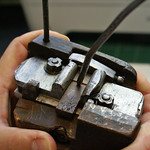
The early fifteenth-century punchcutters also themselves struck and justified the matrices, and cast type. In the sixteenth century the justification of matrices and the casting of type was also handled by third parties. One can imagine that doing the cutting, matrix-justification and casting on the eye must have resulted in an immense amount of work, with no control over the consistency, especially when, for example, matrices were distributed and casting was done by third parties. Using patterns to standardize the proportions of the letters and subsequently their widths made both the cutting and the casting easier. Also one can imagine that such standardizations and systematizations must have been a prerequisite for the spreading of type all over Europe.
One of the findings of Blokland’s research is that it is very likely that Renaissance casters only used a very limited number of mould-register settings, for example a full lowercase set. This was made possible by a standardization of the matrices, which was on its turn possible because of a standardization of the letterforms. Due to the changed proportions of eighteenth-century type, the casters needed extra information concerning the more different character widths. For this purpose matrices were accompanied by so called ‘set letter’, i.e., pre-cast type, which the caster could use to fix the registers of the mould. So, this talk will be about the standardizations, systematizations, and unitizations Blokland hypothesized and actually measured in Renaissance type, and the deviations from these schemes in later times by in this case especially Baskerville, which lead to different production methods.
—————————————————————————————————————————————————————————
Kiel, November 23, 2012: Muthesius Hochschule
Guest lecture in the type design course of Albert-Jan Pool on the Mythical Eye of the Type Designer.
—————————————————————————————————————————————————————————
Hamburg, November 22, 2012: urw++ Global Fonts Konferenz
The Relativeness of Harmony in (Global) Type
This talk addresses the differences in what is considered harmony in formal representations, i.e., type, in use to represent different scripts. The focus is specifically on the fact that harmony is purely relative to the underlying harmonics, patterns and dynamics of type, which are the result of evolution, changes in taste, and (the moments in time of) technical innovations. What is considered to be harmonic, rhythmic, and æsthetic in type is merely the result of the conditioning of type designers and the readers, i.e., cultural habituation. If harmony would be an absolute matter, there would not be so many differences between scripts, and it would not be so difficult to combine them in global type.
Download handout (German text)
—————————————————————————————————————————————————————————
Leiden, November 12, 2012: Leiden University
Guest lecture on type design and, of course, PhD research in the Gutenberg to Gates cycle.
—————————————————————————————————————————————————————————


