With type design, the question is how the added value of someone’s idiom can be estimated if the underlying basis has not been clearly mapped out. The rules (conventions) for type can be determined by distilling the factors, that is, particles, which make up a type design. On top there is the idiom like a layer of varnish. The idiom lies on top of that like a layer of varnish. The extent to which idioms contribute to usability is up for debate: after all, beauty is in the eye of the beholder. Furthermore, the term ‘legibilty’ is easily used by type designers, but what exactly does it mean and how can it be measured?
The quintessence of movable type is that the space is evenly distributed between the characters –regardless of their order. At the same time, the black shapes must form a pattern, which is, of course, inextricably linked to the white-shaped pattern. A calligrapher controls this system by dividing the space with black strokes. The type designer (formerly punchcutter) must chop this pattern by defining the boundaries of the rectangles between the black strokes. This process is essentially completely artificial with regard to writing: the positioning of characters on rectangles while preserving the space balance gave a new dimension and introduced new technical constraints.

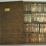
Type design: the sum of partcles
In the Sum of Particles diagram the aspects that in determine the rules (conventions) for type within the Latin script are summed up. These rules may overlap with those of other scripts, especially those related to some degree with the Latin script, such as Cyrillic and Greek. The diagram is intended as a guide to find out exactly what type design entails. The last two rows show ‘formalization’ and ‘idiom’ respectively. Especially the aspects shown in the previous four rows are preconditions for usability: if a typeface does not meet these rules, it could be considered ‘illegible’.
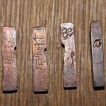
The degree to which formalization is required to improve usability may depend on how one is conditioned. If the conditioning model was the sophisticated and refined type of Claude Garamont and Robert Granjon, the user will undoubtedly prefer it to, for example, the Sweynheym and Pannartz type used in Opera from 1469. After all, the latter model is undoubtedly much rougher. The details in Granjon’s and Garamont’s work, in turn, differ, although they often used almost identical underlying frameworks. The differences are too small to consider that they would make a difference in usability. The idioms of these two master punchcutters form a layer of varnish on top of the archetypal Renaissance models.

Comparison of the idioms of Garamont and Granjon on the same framework
On the right side of the diagram, one can see a column with a gradual transition from the geometric font model to variants that are increasingly formalized and eventually become shapes in which idiom begin to appear. It can be interesting to find out exactly where you consider the type useful and where in your opinion the (excess of?) varnish of the idiom appears.
If type design can be described as the sum of particles and usability is determined by the way these factors are dealt with, then one could argue that in line with this legibility is determined by the same factors. After all, it is highly unlikely that in particular Nicolas Jenson and Francesco Griffo did any legibility research before developing their influential archetypal models for roman and italic (Griffo) type. Neither these two eminent punchcutters, nor their Renaissance peers, appear to have explored the physiological structure of the human visual system in relation to type. The fact that light hitting the retina excites photoreceptors was no doubt completely unknown to them.
Moreover, one could argue that legibility is relative to (the rules for) type models. What we like in the context of the Latin script, rhythmically and harmonically, may be completely absent in other scripts. The same goes for the balance of space between characters. So, instead of looking for the holy grail of legibility through mainly empirical research, the distillation of the rules of the archetypal punchcutters, as laid down in the Sum of Particles diagram, could be applied in an inverse way.
The systems in question are explained on the Systems and Models page. The third chapter of the booklet Reflections on Type and Typography [Related Matters] elaborates a bit on the legibility aspect.