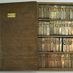
Edward Drinker Cope’s drawing of the Elasmosaurus’ skeleton
1. Elasmosaurus
In the 19th-century the palaeontologist Edward Drinker Cope reconstructed the skeleton of an Elasmosaurus platyurus, and he erroneously placed the head on the tail. After roughly two decades a colleague discovered the error. The tail turned out to be shorter than the neck, and obviously for Cope this was an unexpected proportional relationship between the two body parts. Cope (inadvertently?) manipulated the drawing of the skeleton (above) by not including the back (actually front) paddles.

An erroneous/outdated interpretation of the dinosaurs’ world from 1869 by Edward Drinker Cope
The moral of Cope’s mistake is that the power of the human eye is purely relative to the anatomy of the things perceived. In Art and Illusion (Oxford, 1987) Gombrich notes on this phenomenon: ‘The stimulus patterns on the retina are not alone in determining our picture of the visual world. Its messages are modified by what we know about the “real” shape of objects’. David Kindersley defined in Optical letter spacing (London, 1976) the matter simpler as: ‘It is a commonplace that we see only what we know […]’.
2. Van Meegeren Aspect
An example of how the perception of the past changes, and to which extent this relies on the available information, is formed by the forgeries in the styles of Johannes Vermeer and Frans Hals, which were painted by Han van Meegeren (1889–1947) in the first half of the twentieth century. Van Meegeren cleverly took revenge on the experts, who to his opinion did not take his work seriously enough. He provided the market with ‘Vermeers’ in Caravaggio’s style, which –according to the experts– Vermeer had made in his younger years and which had to that moment to be discovered still. So, Van Meegeren provided what the experts wanted to see, this way emphasizing their expertise. Basically he dazzled them in such a way that they did not see through his forgeries.

Han van Meegeren in front of one of his ‘old masters’
The forgeries Van Meegeren made in the 1930s and 1940s prove that in that period the work of especially Vermeer was perceived differently than it is nowadays. It is difficult for twenty-first century connoisseurs to consider De Emmaüsgangers (see image below) a genuine Vermeer, because it lacks the finesses now associated with the seventeenth-century master. Since Van Meegeren’s forgeries, many studies on Vermeer have been made and subsequently more information has become available. The ‘Vermeers’ by Van Meegeren are for us very much 1930-like, because decades later the style of the paintings reveals characteristics of that time. I have labeled this effect of contemporary influences on one’s view of the past the Van Meegeren Aspect.

De Emmaüsgangers by Van Meegeren (ca. 1935–1937)
The Van Meegeren Aspect is also applicable on revivals of typefaces. The historic interpretations that for instance the Monotype Corporation made of types by Francesco Griffo (released under the names Bembo and Poliphilus), Claude Garamont, and John Baskerville (released as Garamond and Baskerville) are typical for the way type from respectively the Italian and French Renaissance, and the Classicism was perceived in the first decades of the twentieth century.

Griffo’s type from De Aetna (1495) and (the digital) Monotype Bembo Book
The image above shows an enlargement of Griffo’s type for De Aetna (top) from around 1495, and the digital version of Monotype’s Bembo (originally from 1929) at the bottom. The revival differs considerably from the original. In general the letters diverge in the details, but this seems inevitable because in the original printed type the recurrently used letters also differ from each other, if only because of the squashes (the halo effect around the edges of the letters as result of letterpress).
But there are major deviations; for instance the weight in the arch of the n is reduced and the contrast-flow has been changed, which results in a different, less ‘Romanesque’, counter. The most obvious and hard to explain deviation however, is the bending of the second stem of the n. The original movable-type n has two basically straight stems and only the h has a curved second stem, like was common in Latin book-hand minuscules. However, the curvature in the stem of the n of Monotype’s Bembo is nowadays considered to be typical for the typeface, and some people might even think that this is typical for Italian Renaissance roman type too.