A recurring argument from historians against my theories on the standardization of character widths, i.e. fixed mould registers, is that the sixteenth century punchcutters were often not the justifiers of matrices, nor that they were the casters. In the fifteenth century these parts of the movable type production process were often handled by the same person, but later in history this situation changed. However, with a standardized system for the widths a punchcutter could theoretically control the spacing of his type ‘from a distance’, and hence the quality of the complete production. If the justifier and caster were aware of such a system and the type was based on it, the widths could be simply distilled from the design itself. The simplicity of such a system could be an explanation for the fact that there is no documentation on this matter from the early days of typography.

Van den Keere’s Moyen Canon Romain: short serifs and tightly cast
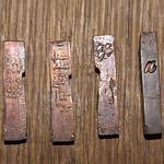
As we all know, an incorrect spacing can ruin a typeface. The simplest possible method which might have been used by casters that I could reconstruct (based on the cadens-units system, like shown in the header-image of this site), is to take the n as a basis and to put just a little bit space at both sides of the serifs (the length of the serifs being based on the unit arrangement system). The image above shows the short serifs of Van den Keere’s Moyen Canon Romain and the subsequent tight spacing. The resulting width can then be used for a large range of other letters, and other groups of letters can be placed on widths based on parts (ranges of simple units) of the n.

Van den Keere’s Moyen Canon Romain cast on standardized widths
For instance I could distill this from Garamont’s Gros Canon Romain type and the related Moyen Canon Romain from Van den Keere (see photo above) in the inventory of the Museum Plantin-Moretus, which are attributed to the sixteenth century (there is no documentation on the casting of these specific types and the dating is therefore a bit uncertain; I am trying to get the C14 method applied to the alloy, but it seems that there is not enough carbon in it).

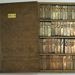
18th century 'set patterns' from the inventory of the Museum Plantin-Moretus
A standardized system would basically simplify the cutting of type, would make the justification of the matrices a bit more work, and would simplify again the casting. Using ‘set patterns’, i.e. example letters for the casters (see photo above), like at least was done in the seventeenth and eighteenth century, is required when type is not made anymore on the proportions of the archetypes of Jenson, Griffo and Garamont, in which the curves are treated as overshoots. Type was condensed in the seventeenth and eighteenth century (the ‘goût hollandois’ or ‘Dutch taste’), and in that case a standardization of the widths in the same way is not possible anymore. Then theoretically it makes sense to shift the standardization part to ‘set patterns’, because the punchcutter does not have a fixed standard for his letterforms, so the matrices cannot be justified accordingly, and a set of pre-cast type has to help the caster to set the registers of the mould by placing the pre-cast type in the matrices when defining the widths.

Dynamic em-square distilled from (Adobe) Jenson’s type
I distilled quite some evidence from historic material that proves that a point size independent and dynamic em-square could have been used to control the proportional vertical relationship between x-height, ascenders/descenders and capital height and the width of the characters, which worked for both textura and roman type, was part of the invention of movable type. I could not find an ‘optical’ explanation for the differences between for instance Le Bé’s Double Canon Romain and Van den Keere’s Canon Romain (see images below), but I could place both in the same geometrically based system. Such a system would have made it possible to change one parameter (for instance for the x-height) and all other measures (ascender/descender, capital height) would change accordingly. Because there is a direct relationship between horizontal and vertical values, everything is interconnected in such a system. I have done some experiments with Jenson’s type and I found more simple standardizations.

Le Bé’s Double Canon Romain captured in a dynamic em-square

Van den Keere’s Canon Romain captured in a dynamic em square
The recent developments of font formats reveal that it is mandatory to foresee as much as possible (future) technical requirements and restrictions and to adapt these prior to the release of the formats. Why shouldn’t the inventors of movable type have done the same? They must have been very clever after all as inventors of one of the most groundbreaking technologies in history of mankind. Besides this, Gutenberg, Jenson, Griffo, Garamont, and many other punchcutters were either engravers or goldsmiths from profession, and this makes it quite plausible for me that applying all kinds of standardizations and regularizations was common practice. The old punchcutters are idealized as artists in our time, but first of all they were craftsmen providing industrial products, I reckon.

Garamont’s Gros Canon Romain (top) and Parangon Romain (Adobe Garamond) compared
I fully agree with the idea that ‘the eye’ of the punchcutter could have played an important role too when it comes to defining proportions, and that my models are to some extent speculative. However, when it comes to visual estimations, it is interesting to see for instance the complete different proportions applied by Garamont in his Parangon Romain and in his Gros Canon Romain (see illustration above). Some unexpected ‘optically defined’ proportions show up especially in the larger point sizes of some French Renaissance type. The proportions of the capitals and lower case in the Parangon Romain are more according to modern ideas of ‘beauty’ and ‘balance’ than the large ascenders, descenders, and the enormous capitals of the Gros Canon Romain are. In the latter type Garamont used three times the x-height for the body and two times the x-height for the capitals. The proportions of Le Bé’s Double Canon Romain are more appealing and I could apply the golden section on it. Van den Keere’s Canon Romain is a large sized type of which the proportions are directed completely to the opposite direction (large x-height), but also seem golden section based, as shown above.

Adobe Jenson on a stem-based grid
I show here some of my most recent findings on possible unit-based standardizations in fifteenth century type. The image above shows the letterforms and spacing of Adobe Jenson on a relatively coarse grid. One can imagine that before transferring the design to the punch, the written letters had to be standardized. If a unit equals the pen width under 30 degrees (0.87 of the pen nib), it is not too difficult for a calligrapher to write such letterforms on a grid. Such a grid should be very helpful for the punchcutter when converting the image to the punch, I reckon. The black lines are indicating the character widths, and the grid-based positioning of the side bearings is almost identical to that in Adobe Jenson.
Some critics will perhaps state that the golden section is a romantic nineteenth century illusion. Amongst others, Renaissance Pacioli already mentioned the ‘divine proportion’ in relation to the Roman imperial capitals, but in line with Morison some people I spoke are convinced that these attempts, i.e. this way of thinking had nothing to do with the practice of the early punchcutters. Besides the golden section rectangle, I applied also root rectangles to translate and extrapolate the horizontal proportions in the archetypes into vertical dimensions, but the golden section was so far the only way I could reconstruct the bodies of a range of (famous) historic types.
Let me underline here though, that it is quite possible that the appliance of the golden section by Renaissance punchcutters was not a goal as such, but the result of a search for standardizing proportions within the body in a dynamical manner.