My daily work at the Dutch Type Library, as type designer, font producer, and software developer forms a solid basis for the development of my insight. Working not only on my own type designs, but also on the typefaces from the different designers who work for my company, is very valuable, as is the study of historic models for the development of revivals.

Modifications on a home computer (around 1984)
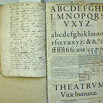
I purchased my first (home) computer, a BBC Electron, in 1983. There was no software available for editing glyphs for this computer, of course. So, although I am definitely not a programmer, I wrote some simple digitizing (vector format), modification, and interpolation software in Basic. The program was named DrawMonkey, and some of the resulting letters (output from a matrix printer) were shown in the 1987 publication 26 letters. Since that time I have become more and more interested in defining and arranging font production processes.

Two pages from '26 letters' designed by Frank E. Blokland (1987)
Since the end of the 1990’s I have been involved as initiator and software architect in the development of DTL FontMaster, a set of batch utilities for the professional font production. The following diagram shows the workflow I defined and built over time (ten years, to be precise) for the production of fonts at the Dutch Type Library. For this workflow, which is based on DTL’s proprietary software, I wrote the command and script files myself, of course.

FontMaster-based workflow for the font production at DTL
After the development of batch-software for the font production the next logical step was to investigate the automation of type design processes. The models I developed over the years already forced me to parametrize parts of the letter-creation process for my students, if only because the digitally trained students more and more tend to see writing with a broad nib and a pointed pen as a remnant of a past era (see also: 4.1 Notes on writing as a basis for type design). It is partly from this experience that I started to investigate the possible standardizations of the ‘font production’ in the Renaissance.
The development of the LetterModeller (LeMo) application, which can be downloaded from this site, was partly the result of this all. It is a primarily a tool for exploring and further developing my theoretical models, but also a tool that can be used for generating (the basic structures for) letters. For my research I have created a monolinear (skeleton) capital font in the IKARUS format, of which the horizontal proportions are related to the width of the m of the primary harmonic model, and which can be modified using LeMo’s parameters.

Concise overview of the two current variants of the ‘Archetype’ font
LeMo was used for the development of the typeface I am developing for my dissertation, named Archetype. The typeface comprises display and text versions, each containing variants based on proportions and details applied in the Renaissance and the Baroque.