The characters which are part of the scripts that are in use all over the world are inventions of mankind. The differences between these scripts and their underlying structures make it plausible that the requirements are mostly culturally and historically based. One can’t apply the same (design) rules concerning harmony and rhythm for the Latin script on for instance Hangul, like the traditional music of Korea is not comparable with Western music and even seems to lack what we call harmony.

Part of a Korean newspaper combining roman type with Hangul
Therefore the rules for typography, derive from the scripts, i.e. the letterforms themselves. Rules like the ‘hierarchy of space’ (the relation between the space in the counters, the space between the letters, between the words, between the lines, and the size of the margins) cannot be universally, i.e. ‘cross-scripts’ applied, but only within the (elements of the) scripts themselves. These rules are anchored in what I would like to name grapheme systems (see 1.1.1 Notes on systems and models).
The grapheme systems are the result of the sum of evolution, direct interference of scholars, and (the moments in time of) technical innovations. They are neither perfect nor sacred, but anchored in conventions. Conventions are blueprints for conditioning and conditioning on it’s turn preserves the conventions. That might be a scary thought for those who lecture type design (at least it is for me!), but we simply have to acknowledge this fact and deal with it.
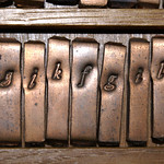
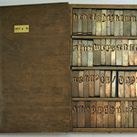
To understand the requirements, or to be able to deviate from these, one has to understand the structure of the underlying systems and models. The themes on which all current type designers make variations, find their origin in systems and models that were fixed in the fifteenth century by the invention of movable type. Type designers basically put a relatively thin (but often complex) layer of varnish by making variations on the more than five centuries old themes which have become the standard. The newly created typefaces are the result then of the designers’ insights, technical skills and, of course, the Zeitgeist.
Letterforms that are made for Latin but which are outside the conventions, like for instance Wim Crouwel’s New Alphabet, can only be judged as such by applying the rules that derive from the underlying structure, i.e. conventions that are defined by the deviating type design itself.