It is my experience that not all present-day type designers embrace the idea that the famous punchcutters from the past applied advanced regularizations and standardizations. The reactions seem to be in line with Fournier’s comment in his Manuel Typographique from 1764–1766 on the attempts of Jaugeon and his colleagues to standardize the design of type: ‘These gentlemen would have been well advised to a single rule which they established, which is chiefly to be guided by the eye, the supreme judge […]’.

One of the design patterns for the ‘Romain du Roi’
When it comes to punch cutting, the patterns for the construction of a new series of types for the exclusive use of the Imprimerie Royale developed by the Académie des Sciences in eighteenth century France are generally considered a unique case. Updike states in Printing types, their history, forms and use (Cambridge, 1937): ‘[…] every Roman capital was to be designed on a framework of 2304 little squares. Grandjean, the first type-cutter who attempted to follow them, is said to have observed sarcastically, that he should certainly accept Jaugeon’s dictum that “the eye is the sovereign ruler of taste” and accepting this, should throw the rest of his rules overboard!’ It should be noticed here that it is suggested that Updike made up Jaugeon’s remark.
The ‘RdR’ is merely treated as an isolated attempt to regularize and standardize type, and so often it is disliked. For instance Fred Smeijers writes in Counterpunch (London, 1996): ‘The best known case of the separation of design from execution is the “romain du roi”. Here in France at the end of the seventeenth century, intellectual reason struggled in a dialogue with practice and human limitations’, and Albert Kapr notes in The art of lettering (München, 1983) : ‘A commission was appointed in 1692 to fix the proportions of the romain du roi. Under the chairmanship of the Abbé Nicolas Jaugeon, it went even further in determining the design of typefaces by mathematical rules and diagrams. We need not overrate all these attempts, for artistic success is scarcely achieved through geometric or scientific means’.

Van Dijck’s ‘true’ shapes (Moxon: top/red) compared with engravings for the ‘RdR’
The framework of 2304 little squares was perhaps not so unique as many authors on type try to let us believe. The relation between the lowercase letterforms in Moxon’s engravings and the plates for the ‘RdR’ (see illustration; the red lines are Moxon’s contours) can be coincidental, but it seems that the Académie des Sciences thoroughly researched publications on type and it is therefore not impossible that Moxon’s Mechanick Exercises was consulted also. And Moxon actually shows in his plates a 42-unit grid, and this results in a framework of 1764 units. That is also quite a lot and Moxon remarks: ‘We shall imagine (for in Practice it cannot well be perform’d, unless in very large Bodies) that the Length of the whole Body is divided into forty and two equal Parts’ and he continues: ‘It may indeed be thought impossible to divide a Body into seven equal Parts, and much more difficult to divide each of those seven equal parts into six equal Parts, which are Forty two, as aforesaid, especially if the Body be but small; but yet it is possible with curious Working […]’.
Just like Moxon, Fournier divided the body also into seven parts, but apparently without the subdivision. In his Manuel Typographique he writes: ‘I divide the body of the letter which I am to cut into seven equal parts, three for the short, five for the ascending and descending, and seven or the whole for the long letters.’

Moxon’s 42-line grid (based on his units)
One wonders why Moxon’s grid seems to be overlooked; is it because he did not actually draw the grid lines, like I did in the illustration shown above? So, could it be that the ‘RdR’ is actually a formalization of a much older process?

Van den Keere's Middelbaar Canon measured with a digital caliper
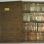
End of 2010 I started measuring French Renaissance type at the Museum Plantin-Moretus in Antwerp to find prove for my ideas about the standardization of widths. One of the types I measured was the Middelbaar Canon (dutch) or Moyen Canon Romain (French), which is an adaptation by Hendrik van den Keere of Garamont’s Gros Canon Romain. The Gros Canon Romain appeared for the first time in 1555, and was ‘extremely widespread over western Europe from about 1560 onwards’ according to H.D.L. Vervliet in Sixteenth-Century Printing Types of the Low Countries (Amsterdam, 1968). Hendrik van den Keere shortened the ascenders and descenders of the Middelbaar Canon, and he made accompanying capitals, which appear in Plantin’s books from 1571 onwards.

The Middelbaar Canon as cast in 1959
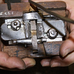
In the 1959 a small set of foundry type was cast from the original matrices of the Middelbaar Canon at the Museum Plantin-Moretus. The letters were apparently fitted (more or less) according to Fournier’s ideas about spacing described in his Manuel Typographique: ‘The letter m of every fount is taken first, and when this is right it is used as a pattern for the others. Three m’s are put in the lining-stick and the first to be cast of every sort is put between them and made to tally with them. The necessary alterations are then made in the mould and the matrix’; the widths of all characters being different. Actually the widths are so different, that things are completely messed up, like the n and h show.

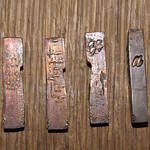
Middelbaar Canon as cast in the 16th or 17th century
As I expected, original sixteenth (or perhaps seventeenth) century type shows a clear standardization of widths and the letters can be placed in groups, like for instance a group with a, c, e, a group ciontaining b, d, g, h, n, o, p, q, v, fi, and one with r, s, t. The results of the measurements (using a digital caliper) show deviations within these groups of approximately 0.2–0.4 mm. These small deviations cannot be felt with one’s fingers, even if the nail is used to check differences in thickness when the letters are lined up. Also the widths of the characters within a group look the same. One can imagine that after casting the first letter of a group, the other letters could be cast using the same settings for the mould’s register. The widths I measured make it plausible that a underlying cadence-unit system was applied to define the relationship (of widths) between the groups of letters.