The Typography Inside Outside Course (tioc) is an online programme that combines practical training with theoretical study of the rich discipline of typography from both historical and technological perspectives. The course focuses on the intrinsic quality of printed communication and is taught by Dr. Frank E. Blokland, a pioneer in digital font production and a vocational educator with more than 40 years of experience in type design and typography.
1. Introduction
2. Description
3. Objective and goals
4. Historical context
5. Approach
6. End terms
7. Seats and requirements
8. Teacher
9. Organization and costs
10. Sessions summary
11. Enrollment
12. Info sessions
13. Frequently asked questions
1. Introduction
Terms such as ‘macro typography’ and ‘micro typography’ have become popular in recent years, although they are essentially synonyms for ‘typesetting’ and ‘typography’, respectively. All contemporary graphic designers are, in that sense, macro typographers. However, how many can explain what forms the basis of pattern formation in letters, or what lies at the origin of typographic conventions? It is easy to devise explanations that are plausible without being firmly grounded in knowledge.
Digital typography is becoming increasingly sophisticated. OpenType layout features, for example, can automatically handle numerous typographic refinements, including ligature substitutions, contextual alternates, figure styles, and small capitals. In addition, design processes can be controlled through automation, for example by using grep, and increasingly through ai. Assessing the quality of these digital outcomes, however, requires an in-depth understanding of typography itself.
The online Typography Inside Outside Course (tioc), delivered via Zoom, develops this understanding alongside the practical skills needed to translate it into tangible results through a critical and analytical approach. Throughout the course there is ample opportunity to discuss progress, exchange ideas with fellow students, and receive individual feedback from the tutor.
![Spread from Reflections on Type and Typograpy […] in InDesign](Images/TIO-course_3_1200.jpg)
Spread from Reflections on Type and Typograpy […] in InDesign
2. Description
The Typography Inside Outside Course explores the aesthetic, conceptual, and ergonomic dimensions of typography. These are examined in conjunction with the technical consequences of typographic decisions, including the use of grep, scripting, and other forms of automation. In addition to optical and technical considerations, attention is paid to the historical origins of the typeface in use, its designer and, where applicable, punchcutter, and the stylistic period on which a revival is based.
The course also investigates the role of artificial intelligence in the typographic process. As ai inevitably becomes more deeply integrated into design practice, understanding both its possibilities and its limitations is essential. ai agents such as ChatGPT can already generate InDesign scripts from written instructions and can use supplied text and images to automate significant parts of the layout process. This raises important questions, ranging from the changing role of the graphic designer to issues of copyright and intellectual property when texts and images are submitted to ai systems.
3.Objective and goals
Participants design three iterations of a book of their own choice, each from a different perspective:
– the industrial designer, with an emphasis on ergonomics,
– the artistic designer, with an emphasis on conceptual expression,
– the intuitive designer, who deliberately ignores conventions where appropriate.
The role of the typographer can range from that of an industrial designer who serves the transfer of information as unobtrusively as possible to that of an artist whose presence is deliberately visible alongside the information. This also raises a fundamental question: does a typographer need to read a book in order to give it typographic form? And if so, how can the outcome be assessed? Does a text have a universal perception, or does every reader inevitably construct a different interpretation?
The chosen book should offer opportunities to explore a wide range of typographic challenges. Throughout the course, the underlying forces behind typographic conventions, the relationship between conceptual and ergonomic decisions, and the technical consequences of these decisions are investigated in depth. The practical component includes the use of automation in Adobe InDesign through grep, scripting, and artificial intelligence.
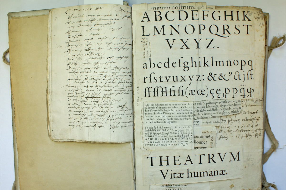
Spread from Volume 153 of the inventory of Museum Plantin-Moretus
4. Historical context
Typographic conventions are the result of a long historical development that began with the transition from handwriting to movable type. Before typography, texts were reproduced by scribes, whose flexible handwriting allowed for a virtually unlimited range of letterform variations and adjustments. Movable type introduced a more restricted set of predefined forms, but at the same time created unprecedented control over the organization of the page.
The printed letter was not simply a mechanical copy of handwriting. Although Renaissance typefaces were inspired by handwritten models, punchcutters transformed these forms into a new system with its own logic and conventions. This development established the foundation of typographic practice as we know it today.
The fundamental principle of arranging letters within a defined space while maintaining visual equilibrium has remained remarkably stable through successive technological transitions, from foundry type to hot-metal typesetting, phototypesetting, and digital type. To critically assess, challenge, or extend typographic conventions, it is therefore essential to understand their historical origins.
5. Approach
Typographic conventions are the result of centuries of experience, cultural traditions, perceptual mechanisms, technical developments, and shared aesthetic preferences. They guide design decisions, but they do not impose a single way of working. Good design is not about blindly following conventions; it is about understanding their origins and purpose, and knowing when to adapt or transcend them in response to a specific situation.
The real challenge for typographers is to understand why certain conventions exist and how they relate to context, function, and the needs of the reader. Ultimately, the value of a design lies in whether it fulfils its intended purpose. Assessing this requires an understanding of both the context and the function of a typographic solution, using conventions as a foundation for informed decisions.
Perception is shaped by prior knowledge, experience, and expectations. Therefore, typographers must continuously examine and refine their own understanding. This critical approach forms the foundation of the Typography Inside Outside Course.
6. Assessment
Presentation: (Parts of) three versions of the same book, accompanied by a written paper documenting the research process, development, and progress.
Evaluation criteria: The depth of the study, the originality and quality of the typographic interpretations, and the level of insight gained into the subject matter.
7. Seats and requirements
The course has room for a maximum of 16 participants, a number based on experience with online sessions and the importance of direct interaction between students and teacher. The minimum number of participants is four, allowing for meaningful discussion, exchange of ideas, and constructive feedback throughout the course.
For participation in tioc, a certain knowledge of typography and/or experience with graphic design is recommended. Since the course combines theory, research, and practical application, participants should be willing to engage with both conceptual questions and technical aspects of typographic practice.
The course is structured in such a way that participants with different levels of experience can benefit from each other. More experienced students contribute practical knowledge and professional insight, while participants with less experience often bring fresh perspectives and new ways of approaching typographic questions. This exchange forms an essential part of the learning environment.

Frank demonstrating at the kabk
8. Teacher
Frank E. Blokland (Leiden, 1959) is a type designer known for typefaces including dtl Documenta, dtl Documenta Sans, dtl Haarlemmer, dtl Haarlemmer Sans, and dtl VandenKeere. He graduated from the Royal Academy of Art, The Hague (kabk), in 1984, where he studied typography under leading Dutch typographers such as Gerrit Noordzij and Jacques Janssen.
From 1986 to 1990, Frank taught at the Graphic School Haarlem, and since 1987 he has been a Senior Lecturer in type design at kabk. From 1995 to 2025, he was Senior Lecturer and Research Fellow at the Plantin Institute of Typography in Antwerp.
In 1990, Frank founded the Dutch Type Library, and a few years later he initiated and supervised the ongoing development of dtl’s professional toolset for digital font production.
In October 2016, he successfully defended his PhD dissertation at Leiden University. His research investigated the hypothesis that Johannes Gutenberg (c. 1400–1468), the inventor of movable Latin type, and his contemporaries developed a highly standardized system for producing textura type, and that this system was later adapted for the production of roman type during the Renaissance in Italy.
A more extensive biography of Frank can be found here.
9. Organization and costs
The Typography Inside Outside Course is offered online via Zoom from January to July. It consists of ten scheduled sessions on Thursdays (the so-called ‘Typography Thursdays’), with three weeks between sessions to allow sufficient time for in-depth home study. This home study requires an estimated 16–20 hours every three weeks.
An additional eleventh session is dedicated to the final evaluation and to planning the production of a book presenting the research results. The sessions run from 10:30 to 17:00 cet, including a lunch break from 13:15 to 14:00 cet. Both the morning and afternoon sessions include two ten-minute coffee breaks.
Dates for the 2027 edition:
14 January, 4 February, 25 February, 18 March, 8 April, 29 April, 20 May, 17 June, 8 July, and 29 July.
The otf Course costs €995 (excl. vat –if applicable). Payment can be made by bank transfer, PayPal, or through the Courses Boutique.
The course fee includes eleven sessions and printed editions of Frank’s dissertation On the Origin of Patterning in Movable Latin Type, his Reflections on Type and Typography [Related Matters], and Dr Peter Karow’s Digital Typography & Artificial Intelligence. In addition, students receive a perpetual license for dtl OTMaster and dtl CompareMaster with a commercial value of €305.
Communication between students and teachers outside the Zoom sessions takes place via a Pumble workspace. Here, ideas and work are exchanged, source materials are shared, and schedules, resources, and announcements are made available.
The personal projects will be collected in a book published by tioc, preferably before the Christmas period following graduation. Upon successful completion of the tioc, graduates receive a certificate. Although this certificate currently has no formal status within vocational education, it provides documented evidence of completion and competence in the field of typography.
10. Sessions summary
Below one will find a summary of the sessions.
– 1. Exploring the movable-type paradigm
Although handwritten models formed the basis of movable type, there is a fundamental difference between writing and typography. The calligrapher creates a continuous, harmonious, and rhythmic pattern, dividing space through strokes. The type designer (formerly the punchcutter), however, divides the space between these strokes through sidebearings, a concept unknown to the calligrapher. The fragmented pattern is subsequently reconstructed by the typesetter and shaped into a typographic composition by the typographer.
This session explores and discusses the historical foundations of movable type and examines how it transformed the principles of handwriting into a new system of visual communication.
– 2. Historical context
Typography is rooted in almost six centuries of development. The use of historical typefaces whose origins date back centuries is still part of contemporary typographic practice, resulting in a highly eclectic typographic landscape. Yet our relationship with historical forms differs from that in other cultural domains. For example, while Renaissance typefaces are frequently used today, Renaissance music is far less commonly encountered in everyday life.
How many contemporary typographers who use revivals such as Adobe Jenson or Adobe Garamond are equally familiar with the music, visual culture, or intellectual context of the Renaissance? And if one is not aware of the historical origins of these digital typefaces, how does one perceive Renaissance type itself? If our understanding of historical type is mediated primarily through modern revivals, to what extent do these interpretations still reflect the characteristics of their originals?
This session explores and discusses the extent to which typographic perception is shaped by cultural conditioning, historical perspective, and the zeitgeist of the observer. Although research can reveal new insights into the origins and development of typefaces, our perception of historical forms remains inevitably influenced by the frameworks through which we have learned to see.
– 3. The quantifiability of typography
What exactly is the purpose of typography, and what is the role of the typographer? How should the position of the typographer be understood, and how does one’s perspective influence one’s approach? Furthermore, can typography be objectively quantified, and how can legibility be measured?
Legibility is frequently invoked by typographers to support design decisions. But what knowledge are such claims based on? Are they supported by research and demonstrable evidence, or do they rely primarily on assumptions and established beliefs?
This session explores these fundamental questions and examines the relationship between measurable qualities, perception, and typographic judgement.
– 4. Perception, calibration, and opinion
What exactly forms the basis of our perception of type and typography, and what is it that we actually (want to) see? After all, perception is shaped by knowledge and experience; one often cannot recognize what one has not learned to perceive. At the same time, it is human nature to interpret observations according to existing beliefs and expectations.
It is also tempting to attribute certain qualities of design to intuition alone, thereby making them appear mysterious or inexplicable. However, the design process involves numerous variable factors that influence perception, such as the presentation of a layout on a flat screen without consideration of the binding, format, or physical reading conditions.
This session explores how perception is calibrated, how opinions are formed, and how conscious awareness of influencing factors can lead to more informed typographic decisions.
– 5. Analysis and choices
What forms the basis for the choice of typeface(s) in a project? Is the decision primarily driven by aesthetic preference, or should it result from a thorough analysis of the text and its technical requirements, such as character sets, figure styles, and available weights and variants?
Furthermore, how do ergonomic considerations relate to aesthetic and conceptual arguments? How can these different aspects be organized and balanced within the design process? Although legibility is frequently used to justify typographic decisions, what actually forms the basis of such judgments?
This session explores the analytical, structural, and technical considerations that guide typographic choices.
– 6. Technical aspects of fonts
How do OpenType fonts and their variable font derivatives work technically? What happens within a font file, and how does this functionality interact with page-layout applications, particularly Adobe InDesign?
This session explores the underlying technology of digital fonts and examines how technical possibilities influence contemporary typographic practice.
– 7. Typographic refinements
Having established the historical frameworks, the origins of typographic conventions, the foundations of perception, and the technical aspects involved, it becomes possible to examine typographic details in greater depth.
How can elements such as word spacing, hyphenation, running headers, notes, and other refinements be analyzed, evaluated, and controlled? On what basis does one choose between justified text and ragged endings? How should line spacing be considered in relation to line length? Should capitals be spaced, and if so, for what reason? How should elements such as page-number placement relate to structures such as the table of contents?
This session focuses on the detailed decisions that determine typographic quality.
– 8. Automation of typographic processes
Consistency, efficiency, and reproducibility are key aspects of graphic design in general and typography in particular. Although many typographic refinements can be conceived, applying them manually throughout a publication is time-consuming and increases the risk of errors. For example, if all acronyms in a text need to be converted to small capitals, a grep pattern can provide an effective and reproducible method, as discussed earlier.
Another approach is to automate parts of the production process through scripting. Designing a book or magazine involves many recurring actions, which can often be standardized and automated. Although developing scripts requires an initial investment of time, the resulting workflows offer greater consistency, flexibility, and reproducibility.
This session explores the possibilities of automating the typographic process through grep, scripting, and related technologies.
– 9. Evaluating the practical outcomes
During the course, participants develop three versions of the same book, approaching the design from different perspectives while incorporating the historical, conceptual, perceptual, technical, and typographic aspects discussed in the previous sessions.
This session is dedicated to the critical evaluation of the practical results. The different interpretations are discussed in relation to the underlying research, design decisions, and the extent to which each approach successfully translates its intentions into a coherent typographic outcome.
– 10. Evaluating the theoretical outcomes
Throughout the course, participants document their research process, development, and progress in a written paper. This session is dedicated to the evaluation of the theoretical foundation supporting the practical work.
The paper is discussed in relation to the depth of the research, the clarity of the reasoning, and the insight gained into the historical, conceptual, perceptual, and technical aspects of typography explored during the course.
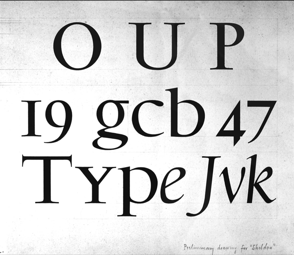
Preliminary drawing for Sheldon by Jan van Krimpen
11. Enrollment
Registration for the 2027 course is now open.
Students can register via this form before December 17, 2026. After a thorough evaluation of this form, candidates will be contacted and further informed. Upon admission, one can pay the required amount by bank transfer, PayPal, or via the Courses Boutique. The course fee must be paid in full in advance and will not be refunded in whole or in part after the start of the course. If, however, due to unforeseen circumstances, one or more sessions are cancelled and cannot be rescheduled, an equal part of the amount will be refunded.
For additional information about the registration, contact the course organization at <tioc [at] lettermodel [dot] org>.
12. Info sessions
We will host a Zoom information meetings for the 2027 course on Thursday, October 8, 2026 and on Thursday, November 5, from 15:00 to 17:00 Amsterdam time. These sessions offer an opportunity to learn more about the course structure and content and to ask questions. To register, please email please email <tioc [at] lettermodel [dot] org>.
13. Frequently asked questions
A list of questions that come up regularly, in random order.
– What are the required basic skills?
Above all a big interest in typography, its historical origin, and its practical functioning. Thorough knowledge of page layout programs is a plus but not a requirement.
– What is the expected time commitment outside of the sessions?
On average, one can expect to spend around 16–20 hours of self-study over the three weeks between the sessions.
– Can I ask questions between sessions?
Yes. The Pumble workspace is available for posting questions and exchanging information with instructors and fellow students.
– Are there additional online sessions apart from the scheduled ones?
Occasionally, students organize informal sessions themselves, especially for collaboration on group projects.
– Are the Zoom sessions recorded, and can I follow the course through recordings alone?
The course is intended to be attended live. Recordings serve as a backup, for reference or in case one cannot attend a session. However, availability is not guaranteed, as technical issues can occur.
– When are course recordings usually made available?
Recordings are shared as soon as possible, usually within a few days after the session. Please note that occasional delays due to technical issues are possible.
– Do I need to keep my camera on during Zoom sessions?
Yes. For privacy and community reasons, having your camera on is mandatory. It is important for creating a comfortable and engaging environment with your peers.
– When do class discussions or q&a typically take place?
A dedicated questions and answers round is usually held at the end of each session. However, questions are also welcomed throughout the session as they naturally arise.
– What kind of license comes with the dtl font tools provided in the course?
The tools come with a perpetual license for the current version. While future updates are not included, they are available at a very reasonable upgrade cost.
– Do the start times change when switching between summer and winter time?
No. The start times remain the same in Amsterdam time. However, this can create a difference compared to countries that do not observe daylight saving time or that switch on different dates.
– If the course is cancelled, will the fee be fully refunded?
The course fee must be paid in full in advance and is generally non-refundable once the course has started. However, if one or more sessions are cancelled due to unforeseen circumstances and cannot be rescheduled, a proportional part of the fee will be refunded. If the course is cancelled entirely, the full fee will, of course, be refunded.
– Is the use of Adobe InDesign mandatory?
No, basically any page-layout program can be used by the participants. However, it cannot be excluded that sometimes such a program requires special exploration.
* * * * *
Disclaimer. The Typography Inside Outside Course organizers and instructors cannot be held liable for any irregularities, inconsistencies, or omissions of any kind in this course description, which should be considered ‘as is’.