When starting the design of a typeface from scratch or reviving a historical type model, determining the boldness of the type is crucial. A key question is how to measure boldness effectively. For example, when creating a roman typeface for text, one might wonder what constitutes a standard weight for the stems. Of course, one can empirically determine the stem width. The question is then how to test this and what one exactly is testing: the resolution of the screen, the density of the laser printer, the quality of the inkjet printer, hinting?
In addition, while examining existing models can provide insights, devising a formula offers a systematic approach. For offset printing, one does not have to take ink squashes into account, as is the case with letterpress printing. After all, there is no dent and associated ink dispersion. If one looks at historical foundry type, what is considered ‘Regular’ today is a little lighter compared to what was considered ‘Regular’ in the past. That said, if one makes a revival today, the ink squash will be included in the following calculations.
Below is a formula I have devised using very basic mathematical principles (unfortunately my knowledge of math is quite limited and rusty). It refers to setting the x-height as a calligrapher does, that is, as a multiplication of the broad-nib / flat-brush width:
– stem width = (x / (p * α)) * sin(β)
This formula encapsulates the determination of stem width, considering both the x-height and the width of the pen utilized. Here is a breakdown of its components:
x: Represents the x-height.
p: Denotes the pen width.
α: Signifies a multiplier for the pen width.
β: Corresponds to the complement of the pen angle from the right angle (90 degrees).
In the case of a pen angle of 30 degrees (measured from the baseline) the formula is:
– stem width = (x / (p * α)) * sin(60°)
As an example, let’s consider the scenario of starting a Humanistic-minuscule-based typeface. Suppose we choose an x-height that is five times the pen width, and a pen angle of 30 degrees: sin(60°) = 0.87. If the x-height is 5 centimeters (with the pen width being 1 centimeter), the calculation for the stem width, measured horizontally, would be as follows:
– stem width = 5 : (1 × 5) × 0.87 = 8.7 mm
If one wants to use this in the opposite direction, i.e., to measure the relationship between stem width and x-height in an existing type, the calculation is: x-height divided by (stem width multiplied by 1.15).
Of course, the x-height can have any value, which can be divided by 5 and multiplied by 0.87. In addition, dividing by 5 can make the stem width a little (too) light. The range of pen-width multiplication is somewhere between 4.5 and 4.95. The average is 4.725; the formula is then:
– stem width = x-height : 4.725 × 0,87
or, simply: stem width = 18,4% of the x-height
One complexity, however, is that the (size of the) x-height in relation to the body size also has an influence. After all, a larger x-height requires somewhat bolder stems, because when scaled to the x-height of a font with relatively long ascenders and descenders, the weight effect should be about the same. As a result, the relationship between x-height and stem width will be probably closer to 4.5 for a large x-height and closer to 4.95 for a smaller x-height. Consequently, we could revise the approach a little and take 4.5 as a starting point for type with a large x-height and use a multiplication factor to adjust the stem width when the x-height decreases. The maximum for the multiplier is then 4.95. If we set the body to 10 units (that would be 1000 units in, for example, Glyphs), then we could define a sort of global ratio range:
• x-height: 6 units; ascender plus descender: 4 units
Adjustment formula: 4.5 × 1 = 4.5
• x-height: 5.5 units; ascender plus descender: 4.5 units
Adjustment formula: 4.5 × 1.025 = 4.61
• x-height: 5 units; ascender: plus descender: 5 units
Adjustment formula: 4.5 × 1.05 = 4.73
• x-height: 4.5 units; ascender plus descender: 5.5 units
Adjustment formula: 4.5 × 1.075 = 4.84
• x-height: 4 units; ascender plus descender: 6 units
Adjustment formula: 4.5 × 1.1 = 4.95
If we use a pen angle of 30 degrees, the formula is:
– stem width = x-height : (4.5 × γ) × 0,87
where γ indicates the adjustment multiplier (ranging from 1 to 1.1)
Feel free to utilize this example as a practical application in your type-design endeavors. Also feel free to improve the formulas if you believe the outcomes require it. I am curious about your results and look forward to discussing them.
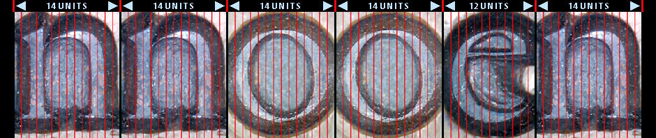
That all being said, another complexity is that the width of the letters has also an influence on the weight. More condensed typefaces will require (slightly) thinner stems to provide the same boldness as ‘normal’ character widths. After all, the space around the stems is reduced. The formula above works for ‘normal’ character widths, which in principle are based on a circular /o.
Moreover, the weight of the stems is related to the contrast. For example, low contrast will result in an increase in boldness if the stem width remains the same. With slab-serif or sans-serif, the stems must be made (slightly) thinner than with high-contrast types. I am going to come up with a formula to deal with this systematically too.
And then there are the stems of the capital letters…