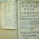
The following image is taken from a type specimen published by Christophe Plantin around 1585. Shown here is the Moyen Canon Romain (cut in 1570), an adapted version of Claude Garamont’s famous Gros Canon Romain (cut before 1549) by Hendrik van den Keere, in which he shortened the ascenders and descenders at Plantin’s request. If you look closely, you will see two letters of the Gros Canon Romain in the text, namely the /long s and /q. When one realizes that this integration requires some technical juggling, this is almost certainly not a mistake –especially because of the central position of both characters.
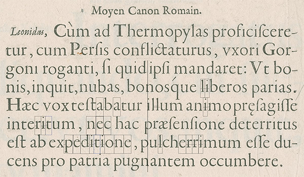
Type specimen published by Christophe Plantin around 1585
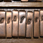
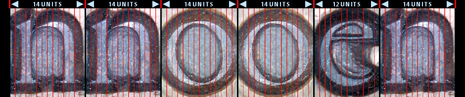
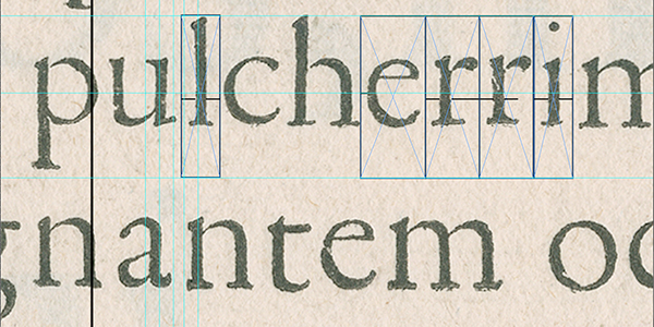
It can be interesting to distill the width of the characters from the specimen. For this I have devised a method of which you can see traces on top of the Plantin copy. The method is as simple as it is effective (image below). Regardless of whether the spacing is done optically or according to a predefined pattern, in roman type normally at least two letters have identical positioning of the left and right side bearings within the x-height: the /l and the /o, because within the x-height, these letters are (except from some possible optical corrections) symmetrical. When a text contains a string of two /l’s or twice the /o, the side bearing between the repeated letters will be centered by definition. A higher resolution version of the print in question (27 mb) can be downloaded from here.
Finding identical left and right side bearings
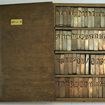
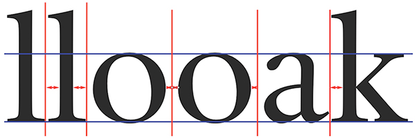
Once the position of these side bearings has been recorded in a historical print, the text can be checked for other instances of the same letter and the side bearings of the adjacent letters can be determined simultaneously. There will also be many shapes related to the /l and /o, which will normally share the same side-bearing positioning. For example, the left side of the lowercase /k will usually be identical to the left side of the /l and will therefore have the same positioning in relation to the side bearing. The bowls of /b, /d, /p, and /q will most likely share the positioning of the /o’s side bearings. You can check the intrinsic standardization of the underlying written model (basically the Carolingian minuscule) with the LetterModeller application.
Solving the character-widths puzzle
To find source material for distilling character widths, one can, for example, consult the Incunabula Short Title Catalogue website. This catalogue is the international database of 15th-century European printing compiled by the British Library with contributions from institutions around the world. For example, one can search for ‘Nicolaus Jenson’, ‘Erhard Ratdolt’, or ‘Aldus Manutius’. There will be links to 'Electronic Facsimiles' whose quality may be high enough for the job.
To search for publications from the French Renaissance (16th century), one can consult the Bibliothèque nationale de France website. For example, search for ‘Robert Estienne’ or ‘Robert Granjon’. Also in this case one may be able to see digital copies of the books found.
More information on the spacing/fitting of type can be found in Chapter 4 of On the Origin of Patterning […].