The latest news (sideways) related to this PhD research.
—————————————————————————————————————————————————————————
’s-Hertogenbosch, 11 December 2020
Short video by Sander Neijnens with the Ascendonica Romaine matrices, the assumed unit system, and the resulting digital font. This was made as part of the Expert class Type design 2019–2020 course project, for which a group of international students explored models by the French Renaissance punchcutter Robert Granjon (1513–1589) as the basis for a digital revival. The research question was whether there is cross-standardization between Granjon’s roman and cursive Ascendonica models.
—————————————————————————————————————————————————————————
’s-Hertogenbosch, 12 October 2016

Dr. Blokland in front of the Opposition Committee after receiving his diploma
On October 11, 2016 at 11:15 a.m. Blokland successfully defended his PhD dissertation at Leiden University. Blokland’s research was conducted to test the hypothesis that Gutenberg and his colleagues had set up a fixed standardized and even unitized system for the production of textura type, and that this system was extrapolated for the production of roman type in Renaissance Italy.
—————————————————————————————————————————————————————————
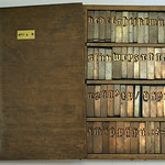
’s-Hertogenbosch, 22 September 2013
On Wednesday August 28, 2013, in the presence of the Expert class Type design 2013–2014 (Plantin Institute of Typography) students, Guy Hutsebaut of Museum Plantin-Moretus and Blokland tested (again) the latter’s theory on the systematization of the Renaissance font production, culminating in the standardization of character-widths in matrices. From Garamont’s original 16th-century matrices of the Gros Canon Romain the complete lowercase was cast using a fixed setting for the mould’s registers. By just centering the lower-case l and adding a little bit of space at both sides of the serifs, it was possible to properly cast the complete lowercase with the same register setting for the mould.
EcTd-student Kees Kanters recorded the casting, which resulted in the video above.
—————————————————————————————————————————————————————————
’s-Hertogenbosch, 14 October 2012

Spread from Reading Letters: designing for legibility
In the recently released book Reading Letters: designing for legibility by Dr. Sofie Beier, Chapter 4 Theories on letter structure describes on three dedicated pages (the background of) some of Blokland’s models and theories. The other two approaches described in this chapter are the mostly calligraphy-oriented ones by Edward Johnston and Gerrit Noordzij.
—————————————————————————————————————————————————————————
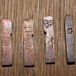
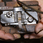
’s-Hertogenbosch, 18 January 2011
On Tuesday January 11, 2011, type was cast directly from the matrices made by Claude Garamont for his Gros Canon Romain and from Hendrik van den Keere’s matrices for his Moyen Canon Romain at Museum Plantin-Moretus in Antwerp. The purpose of the casting was to test whether the standardization of character widths measured in historical foundry type, which seem to prove Blokland’s theories about the standardization, regularization, and unitization of Renaissance type, could also be traced back to the original matrices.