free: LetterModeller 7
LeMo is a first step towards the automation of type design processes, based on the underlying models for grapheme systems. Sliders can be used for the parametrized altering of the letterforms. The modified letters can be saved in the be format and further processed in the included sophisticated glyph editor, and exported as OpenType cff and ttf, and also ufo font files. be files can be imported in LeMo. The development of LeMo was part of Blokland’s PhD research, as described on this site’s homepage.
Download
– macOS [16.9 mb]
– Windows 32-/64-bit [30.9 mb]
– Linux [23.9 mb]

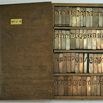
Splash screen and gui of LeMo
The LetterModeller application is also a research tool for investigating (the relation between) grapheme systems, harmonic systems (subdivided in harmonic models), proportional systems (subdivided in proportional models), relational systems, and rhythmic systems (see also: Systems and Models). It focuses on the grapheme systems capital, book-hand minuscule, and cursive minuscule (not built-in yet) in use since the Italian Renaissance, and the morphologically related book-hand minuscules from the late Middle Ages (textura and rotunda, to be precise). The current version of LeMo does not support the flexible pointed pen, but this is a matter of time.
Notes on the applied construction methodes
LeMo combines the ‘primary harmonic model’ (phm) with heart (skeleton) lines for constructing letters (see also: Construction of Letterforms). Heart lines are used to define the proportions of capitals, and a vector can be applied for tracing these lines. The Humanistic minuscule is the result of constructing letter forms with the broad nib. With exception of the letters k, s, v–z, which find their origin in the capitals, these letters are constructed using the phm. Also the two-story g is not part of the phm. The capital-derived letters can be constructed using heart-line constructions.
In LeMo the proportional relationship between the capitals and minuscules is fixed, but this relation can be altered by changing the heart-lines, which are stored in a skeleton font (ikarus format). The generic skeleton forms of the capitals in the skeleton font can be adapted or replaced by any other mono-linear descriptions. Also it is possible to supersede any letters of the phm by defining skeleton forms for these.

Heart line for capital B defined in the ikarus format
The skeleton font can contain all characters in the ascii range (see also the Read Me file that comes with LeMo). The characters in the skeleton font will supersede any characters that are in the phm. The height of the capitals is related to the ascender height of the phm; when the length of the ascenders is changed in LeMo, the height of the capitals will be changed accordingly. The basis for this relation, i.e., the starting point for the transformations, is defined by the proportional relation between the capitals and the phm when applying a certain range of parameters. One way to define this relationship is to reduce the pen-width for both the phm and the capitals to a heart line. For example, this relationship can be like what Claude Garamont used in his type, which is shown in the illustration (for which the Adobe Garamond Premier was used) below.

The proportional relationship between capitals and lowercase defined
The default skeleton font is in the ikarus format. Its name is hard-coded and should be ‘skeleton.ik’, otherwise the file will not be recognized. For the Windows version the skeleton font should be placed in the current working directory, i.e., where the program’s executable resides. On the Mac, the file is expected to reside in one of the application’s sub-directories, namely in …/phm.app/Contents/MacOS/. However, another ikarus skeleton font can be selected from the button ‘Select skeleton file…’.
Skeleton fonts can be constructed using dtl FoundryMaster. Alternatively, another font (Bézier) editor can be used for constructing and subsequently this can be converted to the ikarus-format with dtl OTMaster. Because the construction of the serifs is related to that of the primary harmonic model, serifs cannot be added to the skeleton font using the applicable radio buttons. Exceptions to the parameters cannot be applied to the skeleton font either (for the moment).
LeMo includes a glyph editor for after exporting the parameterized font data. Glyphs can be exported in the eps and svg formats from the glyph editor. Basically this editor is identical to the one in dtl OTMaster, so the applicable part of the otm Manual can be used for reference.

LeMo’s outline editor
As mentioned, LeMo is also an attempt to come to a parametric form of type design, which, because of the built-in descriptions of the capitals and minuscules, doesn’t require any input from the user other than parameter settings. In this it completely differs from all other attempts in this direction. I have no doubt that it will be possible to develop a tool, which will completely interactively generate fonts at the end.
If something can be defined, it can be programmed, in my opinion. However, there are two hurdles to overcome: first, it will be necessary to have a detailed description of personal patterns and structures, i.e., idiom, in relation to the underlying generic letter forms, and second, such a development will require a lot of resources. At the end it should be possible to generate fonts in a certain style with specific settings for the proportions, contrast and weight.
It definitely will take quite some time before this is possible, and until that time LeMo can be used to generate generic letter forms with all forenamed settings except for the idiom. For the moment the type designer will have to apply his personalized patterns and structures in the glyph editor.
—————————————————————————————————————————————————————————
free: Kernagic b2
Kernagic is an Open-Source (semi-)automatic spacing tool for ufo font data (ufo can act as a superset of other formats, and tools like FontForge (guide for installing under macOS) can be used for converting to and from it. It provides ways to interactively preview global and local changes to the horizontal metrics. So, the spacing can be manually altered in Kernagic, or the glyphs can be adapted to the rhythm in the font editor, if applicable. The spacing determined in Kernagic can be stored into the ufo file in question, of course.
The application is intended to be modular, so any programmer familiar with c and a minimum of gtk+ can explore their own methods. The internals of Kernagic can express kerning but the currently implemented methods only produces spacing.

Preliminary interface of Kernagic
Download: macOS Mojave and newer (Wineskin) [440 mb] | Windows [5.7 mb]
The development of Kernagic started in Madrid at the Libre Graphics Meeting 2013, when Øyvind ‘Pippin’ Kolås decided to hack around the automatic font-spacing challenge. There, Dave Crossland introduced him to Frank E. Blokland’s PhD research, published partly on this website. The initial ‘averaging’ approach that Pippin explored was later discarded, in favour of an approach of stem rhythm placement that is based on –but at the end deviates from– Blokland’s theories. This can be found in the Snap gap method. The forenamed deviations are a point of discussion between Pippin and Blokland, and the program was further developed in cooperation with Frank Trampe, known from the FontForge development. Besides, Kernagic has to be pronouced ‘Kemagic’ (Pippin’s idea behind this is that the ‘rn’ combination can be mistakenly read as ‘m’, especially in the case of sans-serif typefaces).
Spacing Methods
Below the three various spacing methods implemented in Kernagic to date are listed.
1. Original
Shows the original spacing of the font, (includes fast switching between the original spacing and newly created ones using the f1, f2, or f3 keys).
An additional option is available here to proportionally scale the existing side bearings.
2. Cadence
Currently provides a fitting that assumes that the glyph-structures of the selected font are related to Italian and French Renaissance text type (think of Jenson, Griffo, and Garamont). Because the units are distilled from the font in question, the method works for typefaces that don’t have similar proportions, but which are morphologically related, i.e., that handle the (overshoot of the) lobes in a similar way as the prototype cutters did. So it also works for, for example, fonts that have ‘goût-Hollandais’ proportions, such as dtl Fleischmann. Consequently it will work for typefaces like Times (New Roman) and Plantin too, of course. And everything in between.
Spacing is defined in cadence-units, using a predefined table. The user can subsequently adjust the values based on the morphological differences between the model used for the table and the font in question. An internal table is referred to by default; this one also comes with kernagic as a text file, which be can be adapted and extended using a text-editor. A user-defined table can be directly selected also.
This means that the program must be able to recognize, for example, whether the font is a serif or sans-serif typefac. Also, the curve flattening must be recognized, i.e., the degree of overshoot of the round letters compared to the ‘stem’ letters (so, for the Jenson model in principle the largest and for the textura model the smallest). Then the most suitable table should be automatically selected. The user should be able to save the corrections he has made in a new table. And yes, it will also include tables for italics. Another consideration is the resolution of the cadence grid (and then the refinement of the tables).
An updated version of the default hard-coded table be can be downloaded here. A version for sans-serif fonts will become available shortly.
3. Snap gap
This methods permits specifying a desired gap between left and right rhythm points of glyphs. The bearings indicated by the gap is also snapped to grid in such a manner that the advance of the glyphs is a multiple of the snap value. The snap-gap method relies on automatically detected rhythm points, if the rhythm point detection works poorly with your font, or you want to override spacing decisions, one can insert one’s own rhythm points by clicking within the x-height of the glyph to change in the preview; rhythm point overrides are saved in the individual glyph files. Clicking below the x-height of a glyph removes custom overrides; clicking above it inserts a single rhythm point to be used for both left and right sides of the glyphs.