This blog provides information about the doctoral research of Frank E. Blokland (Leiden, 1959) at Leiden University, usually presented as ‘notes on’. The subtitle of this research, which lasted from October 2006 to October 2016 and resulted in this dissertation, is Renaissance Standardisation, Systematisation, and Unitisation of Textura and Roman Type.
Prof.dr. Adriaan van der Weel and Prof. Frans de Ruiter were the supervisors.
Short animation by EcTd-graduate Nicolas Portnoï showing digital glyphs and character widths distilled
from matrices of Robert Granjon’s Ascendonica Romaine (i.e., Double Pica Roman or Gros Parangon).
Current practice among type designers places quite a bit of emphasis on technical matters, especially on advanced OpenType-related technology (e.g., variable fonts) and data-storage formats. Perhaps this emphasis on technology was also the case more than 500 years ago. The ongoing research described on this blog is being conducted to test the hypothesis that Gutenberg and his peers have developed a standardized and even unitized system for the creation of textura foundry type, and that this system has in fact been extrapolated to the production of roman type in the Renaissance. Italy. For this purpose, the Humanist handwriting was cast in intrinsically predetermined, standardized proportions. This research aims to demonstrate that technical aspects of Renaissance type production had a direct influence on the proportions of roman and italic type, and thus on the associated conditioning that forms the basis of our perception.
Blokland’s research not only provides more insight into the origins of Latin (movable) type, but the results can also be used for the production of current digital typefaces, and even for the parameterization of type-design processes. This blog provides practical information and software for applying customizable frameworks based on the patterns derived from the archetypal models for roman and italic type.
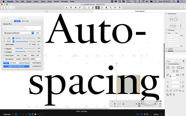
The auto-spacing tool ls Cadencer based on an algorithm of Blokland was developed by Lukas Schneider
Theoretical context
The recognition of the central place of the pen in the historical development of type and therefore of the importance of (knowledge of) writing for the design of type has always been shared by many in the field. There is not much debate about the fact that written letters were initially standardized and eventually formalized by the Renaissance invention of movable type. Berthold Louis Ullman notes in Ancient Writing and its Influence (New York, 1932) that early printers based their typefaces on the handwriting common to the books of their day. According to Ullman, they imitated it as closely as possible, so that when compared, their printing would be on par with handwritten books.
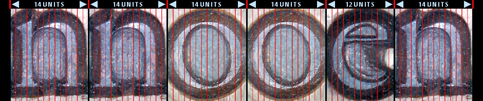
Gutenberg’s 42-lines Bible type (1455) shows standardizations in horizontal and vertical directions
This imitation may have been the case for books printed in textura type, such as those by Gutenberg and Fust and Schöffer. After all, the written textura quadrata was a perfect model for justifying and casting type, because it made the equal division of space between the letters on rectangles quite easy. The number of character widths can also be limited, making it possible, for example, to cast with fixed-width moulds or fixed mould’s registers. Standardizations and systematizations could have been applied relatively easily at different levels: to punches, matrices, and the casting of textura type.
Sweynheym and Pannartz’s unsophisticated roman type from 1472 shows standardizations
The transition from the handwritten Humanistic minuscule to roman type, and later from the Humanistic cursive to italic type, must have been more complex than the transition from the written textura model to textura type if the script was taken unchanged as a basis. But it is actually difficult to trace a literal interpretation of Renaissance handwriting in archetypal roman type. For example, some standardizations in the roman type of the brothers Da Spira and Nicolas Jenson are actually similar to those in textura type. Producing roman type with the same scheme in mind as was used to cast the morphologically related textura model would certainly have helped simplify matters.
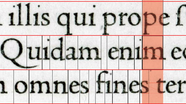
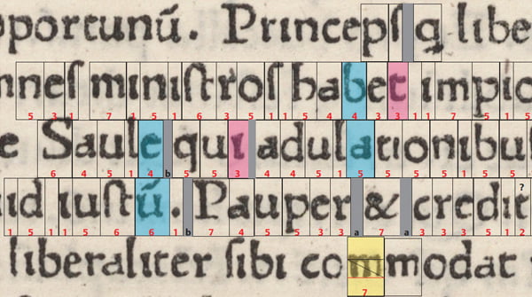
Jenson’s refined roman type of 1470 shows similar horizontal standardizations in addition to vertical ones
The hypothesis for this research is that such an approach requires a standardization of the proportions of type, not only in horizontal direction for the characters and their widths, but also in vertical direction for x-height, ascenders and descenders, and capital height. The horizontal and vertical dimensions in type are inextricably related. In principle, this could imply that Renaissance type was made on predefined proportional system, which not only made the creation part, that is, the cutting of punches, easier, but also the justification of the matrices, the casting of type, and the justification of text.
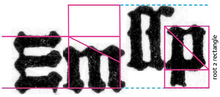
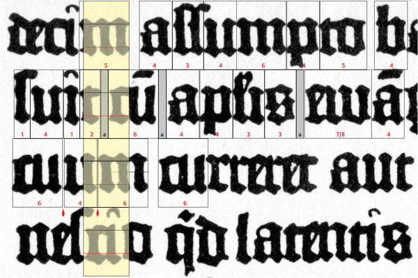
The relationship between em-square and ascenders/descenders in Gutenberg’s textura type from his 42-line Bible
If the existence of systematizations can be proven, this would also help to explain the transition of a profession practiced initially by only one person, i.e., the punchcutter, who manufactured the punches, matrices, and cast the type, into basically three parts: punchcutter, matrix-manufacturer/justifier, and type caster. The spread of type all over Europe must have been easier if spacing-intelligence (an extrapolation of the standardization of character-proportions) had been incorporated into the matrices.

TYPO Labs 2017: How archetypal patterns can improve (the production of) digital type.
Hypothesis
Given the differences between the handwritten models predating the invention of movable type, first textura and then roman type, is it possible that –at least to a certain extent– the proportions and details of roman type are the result of patterning? Later punchcutters could place a greater emphasis on the eye because for them, optical judgment took for granted the underlying patterns, almost without consciousness: it was simply the framework in which things were done. However, considering the fact that the Renaissance punchcutters were craftsmen who invented, organized, and executed a complex and sophisticated production process, how likely is it that this was possible without extensive structuring of handwritten letterforms? The question is: were the Renaissance archetypal models by Jenson, Griffo, and Garamont made with the use of patterns? And if this is the case, are harmonics and æsthetics in type, which are embedded in typographical conventions, not only the result of optical preferences predating the invention of movable type, but also of standardization in the Renaissance type-production processes?
These questions lead to the main hypothesis:
The creation of roman type was influenced at least as much by technical as by æsthetic considerations.
And two subhypotheses:
Roman type is the result of the standardization in the Renaissance of the Humanistic minuscule to the font-production process. This is in analogy to the standardization that took place when the already rather ‘unitized’ gothic hand was used as the basis for textura type.
Æsthetic preferences in roman type continue to be conditioned by the early standardization of roman-type production.
This culminates into the following research questions:
– How were the structures of textura type translated to roman and (later) italic type?
– How were the handwritten models standardized for roman and italic type?
– To what extent was the Renaissance font production systematized? Did the punchcutters apply, for example, sophisticated forms of unitization?
– Did such standardization and systemization preserve optical preferences for form, rhythm, and harmony (distilled from the handwritten origin), or did they create new ones through the adaptation of the written letters to frameworks, generating a new foundation for the conditioning of ‘the eye’?
– How does this theory relate to the generally accepted idea that the eye of the punchcutter has been the deciding factor, and calligraphic models the templates, and in which Jenson, Griffo, and Garamont, the first of whom was an engraver and the other two were goldsmiths, are then more or less regarded as type designers?
– Why is it that seventeenth and eighteenth-century descriptions of the type-founders’ practice by, for example, Moxon and Fournier do not mention the aforementioned extrapolation of the textura model, and subsequent standardization of proportions and character widths?
– Could there be a direct relation to different fitting methods for type, such as the application of ‘set patterns’, and the deviations of Renaissance proportions in later roman types, such as due to the ‘goût Hollandais’?
– If proportions and structures of Renaissance textura, roman, and italic type are the result of standardization, is it –after mapping this standardization– possible to analyze and reproduce related parts of the type design process artificially? If so, what does this tell us about the creative part of the type design process, in which –as mentioned– many believe that the eye rules?
Central argument
The central argument of Blokland’s dissertation is that the harmonic and rhythmic rules for grapheme systems and subsequently for typography, and the related conditioning, which forms the basis for the ‘mythical eye’ of the type designer (or ‘the supreme judge’, as Pierre Simon Fournier named it in his Manuel Typographique [1764–1766]), always are relative to the applied models. The underlying patterns of these models are the result of evolution, changes in taste, and (the moments in history of) technical innovations. What is considered to be harmonic, rhythmic, and esthetical in type is merely the result of conditioning, i.e., cultural habituation, of their creators, i.e., type designers, their appliers, i.e., typographers, and their users, i.e., readers. If harmony and rhythm would be absolute matters, there would not be so many differences between scripts.
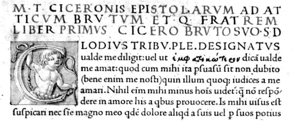
Jenson’s roman type, as used in Epistolæ ad Brutum from 1470 (Museum Meermanno col.)
In case of the Latin script, graphemes were formalized and fixed by the Italian Renaissance punchcutters Jenson and Francesco Griffo. Their archetypes were, and still are –directly or indirectly– the prototypes for later variants, as made by, for example, the 16th-century die-cutter Claude Garamont, the 17th-century punchcutter Christoffel van Dijck, and the 20th-century type designer Jan van Krimpen, just to name a few. The way type designers, typographers, and readers look at type is subsequently also fixed by forenamed Italian Renaissance punchcutters.
Note that the Garamont model is still preferred ‘today as the most natural and invisible of typefaces’, as Prof.dr. Vervliet wrote in the Journal of the Printing Historical Society in 1965. As such this is perhaps a bit curious, because one would expect that over time the model would become more crystallized and sophisticated, and therefore more preferred. This is clearly not the case with the models from Garamont and his Italian precursors, which we, as mentioned, are so much familiar with.
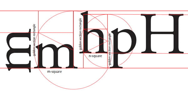
Horizontal proportions of Garamont’s Parangon Romain translated into vertical dynamics
In the dissertation all facets of harmony in formal representations of the Latin script are described. This is basically unexplored territory. The underlying structures of type in use since the moment that the invention of movable type was introduced in Italy in the fifteenth century have not been coherently mapped so far. Attempts have been made to capture letterforms in geometric models, such as the reconstructions of the Roman imperial capitals by the likes of Felice Feliciano, Luca de Paciolli, Albrecht Dürer, Giovan Francesco Cresci and many other Renaissance artists, calligraphers, and scholars. There were also the geometric patterns by the Académie des Sciences for the construction of roman type during the passage from the seventeenth to the eighteenth century.
However, these Renaissance and Baroque pattern-descriptions were absolute, i.e., they were meant to describe and define certain letter forms via outlines created with ruler and compass. The mutually different patterns for basically the same capital letter forms from Feliciano and consorts, and later the ones by Jaugeon’s committee for roman type, did not serve as generic models for describing the underlying structures, but their purpose was to provide specific construction methods for specific letter forms. So, the structure of these letter forms were fixed and the patterns were not meant for further modification.
By contrast the present research comprises the development of software for parametrized type design, and for measuring and analyzing (digital) type and typography. As mentioned, this site provides some more insight into Blokland’s research, and it reveals a couple of the models and patterns he developed over the years.
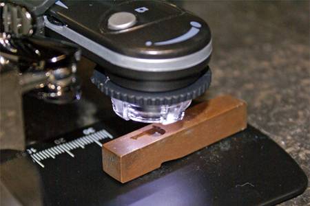
Digital microscope (meant for checking computer boards) with matrix of Garamont’s Gros Canon Romain. Photos were used for the masthead of this site.
Research Methodology
Some of the models that also can be found on this site are purely theoretical, and others are the result of empirical research. For distilling information from historical type, like proportional and rhythmic systems, Blokland measured punches, matrices, prints, and even digital revivals. For measuring standardizations of width and possible unitizations of matrices and type, only the research of this metal material makes sense, of course. For measuring the proportions within the body, i.e., the relation between the x-height of the lowercase, the capital-height and the length of the ascenders and descenders, punches, matrices, prints and also carefully created revivals can be used.
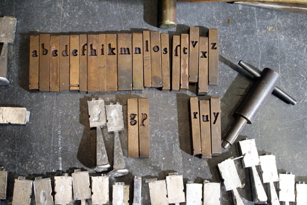
16th-century matrices of Garamont’s Gros Canon Romain with new-cast type
To prove the application of standardized widths in Renaissance type Blokland started measuring type by Claude Garamont and Hendrik van den Keere in the collection of Museum Plantin-Moretus. Although this type is attributed to the 16th-, or at latest the 17th-century, it is not possible to be completely sure about the age. The c14 technique cannot be used for dating, because there is not enough carbon in the alloys. In principle, this problem was of limited importance for Blokland’s research, because the idea is that the standardization of the matrices determines the widths of the cast type, but to circumvent it completely type was cast from the original 16th-century matrices.
Focus
For those who consider Blokland’s research to be primarily focused more on the technical fundamentals of type design than on the artistic aspects, it is perhaps good to know that he is by origin a calligrapher, lettering artist, and type designer. The small –relatively arbitrary– selection from Blokland’s œuvre presented in his biography , proves his work never suffered from dogmatically applied patterns and grids, although sometimes the use of these was unavoidable.
Footnote
It should be noted that although Blokland has formal permission from his Dean and his supervisor to publish material from his research here, the information provided is not in any way officially approved or endorsed by Leiden University.
Some of the (now updated) information provided here has been previously published on, for example, the Typophile forum and the ATypI member list. Also some of the theories and images were presented by Blokland during talks at conferences on type and typography, such as the ATypI conferences in St. Petersburg (2008), Dublin (2010), and Reykjavik (2011), and at the Type[&]Design 2009 conference in The Hague.
Please note that everything exposed here, from content to structure and design, can –and probably will– be subject to changes (see also Terms above). After all, this is work in progress, and a blog is a dynamic medium, of course. Furthermore the info is provided as snippets, i.e., excerpts from the dissertation currently under development.


Notes to this blog
From the moment I posted some information about my research on the web and talked about it at conferences, I received positive responses, but predictably and inevitably also a few negative ones.
To start with the positive responses, I got some supportive comments from very leading experts in the field. For example, Charles Bigelow of the Rochester Institute of Technology wrote on the ATypI membership list: ‘What a fascinating and valuable study!’ Font technology pioneer and theoretical physicist Dr. Peter Karow wrote me in an e-mail ‘Your research is truly broad and complete as far as I can see it.’ Moreover, Dr. Jürgen Willrodt, expert programmer of font tools and theoretical physicist, stated also in an e-mail: ‘[…] I think there is much insight in your work and the underlying model you have and it is certainly a bigger intellectual work than just measuring hundreds of typefaces and attributing the results to the individual decision of a designer.’
With regard to the negative responses, some type designers pointed out in particular that I underestimated or even misunderstood the type designer's "eye" and that my measurements were generally not very helpful. As one typeface designer wrote on the Typophile forum: ‘[…] I don’t think you will learn much by taking pictures of sheep and nuts and measuring them […] I don’t think the measurements of Jenson etc. are that relevant either […].’ However, if one wants to understand the basics of type design, measurements of the archetypes are very relevant, I reckon.
In case of the dynamical (e)m- and (e)n-squares I distilled from Renaissance type, there were some initial reactions of designers who considered the 1:1 application of the geometrical systems impossible on punches. I reckon that there was indeed no nanotechnology available in the Renaissance that made this possible, but as I point out on this site, the punchcutters could have calculated the proportions at a large size and subsequently could have scaled down the outcomes to the size of the punches. The proportions could have well been translated into a units, like I show in the note on the (origin of the) em and en squares.
Also not all type historians I had contact with are convinced that researching standardizations and systematizations in the Renaissance production process of movable type makes sense. Let me first make clear that I am not a type historian; I am more a sort of a type archeologist. I excavate, distill, and reconstruct using my thirty years experience as type designer.
On the aforementioned Typophile forum a prominent type historian wrote: ‘No punchcutter could ever dictate the spacing of a type: it was all done by judgement of the caster.’, and ‘Yes, geometrical analysis is fascinating and it can probably give us real insights into some designs. But I am afraid that it often turns into a kind of enclosed system, isolated from the shop floor that we, as compositors and readers, work on. […] Welcome to the real world.’
It will not come as a surprise that based on my measurements and distilled models and casting, I very much doubt that the spacing was by definition always ‘done by judgement of the caster’. I believe that prior to the use of ‘set patterns’, the spacing was an extrapolation of the standardization of character-proportions. When it comes to practical usage of my findings, the models as shown on this blog will be applied in software for analyzing type and in software for designing type. So, there will be no isolation from the shop floor in this case, and this fact makes my reserach definitely part of the real world, I reckon. But let me underline here that I am just exploring and investigating, and that I welcome any solid evidence, which proves that I am wrong; what I state here is not untrue until proven to be untrue. So, basically this blog should also be considered as an invitation to discuss my findings.
A recurrent argument against my hypothesized regularizations of Renaissance movable type, is the complete lack of documentation on type founding from that time. One can actually use the same argument against everything that has been written so far on the subject, and which seems to be based on the projecting of the 17th and 18th century documentation on the subject on the earlier centuries. My measurements of historical material and the actual casting from renaissance matrices seem to underline the correctness of my thesis so far.
Finally, it is tempting to imagine that it was not pure coincidence that movable type was invented during the time of the rigid textura quadrata. Because it is tempting to speculate that the early German type founders already took into account that the system used for textura fonts should later be useful for other representations as well? Next, the body or em-square had to be defined so that it could serve both the gothic and the humanist type. And as is the case for the PostScript and TrueType em-squares for digital type, it is not unlikely that the early punchcutters determined the ratios in a format that was independent of the measurement systems of the time. But this is no more than a footnote as it is a bit off topic.
If you have any questions or comments, please contact me at blokland [at] dutchtypelibrary.com
Frank E. Blokland